People rely on iPhones to stay connected, play games, view media, complete tasks, and track personal information anytime, anywhere.
For iOS app development, start by understanding the following fundamental device characteristics and patterns that characterize the iOS experience. Using these features and patterns in your design decisions can help you deliver apps and games that iPhone users will love. Almost 3.8 trillion hours people spent using mobile apps during last year.
Advertisement
The iPhone has a medium-sized, high-resolution display. When working with iPhone, you typically hold it with one or both hands and switch between landscape and portrait modes as needed. While people are operating their devices, their viewing distance is usually only 1-2 feet.
Input
With multi-touch gestures, an on-screen keyboard, and voice control, users can take action and perform meaningful tasks on the go. In addition, apps often want to use location information and input from the device’s accelerometer and gyroscope and may also need to interact spatially.
App interaction
Some people only spend a minute or two checking for events and social media updates, tracking data, and sending messages. We can also spend an hour or more browsing the web, playing games, or enjoying media. People tend to have multiple apps open at the same time and like to switch between them frequently. Apple Store has 1.96 million apps to download.
System Function
IOS provides several features that help users interact with the system and apps in a familiar and consistent way.
Recommended Course of Action
A great iPhone experience integrates the platform and device features that people care about most. To make your design work well on iOS, prioritize the following ways to incorporate these features.
Guideline of IOS Design
Limit the number of on-screen controls and reveal secondary details and actions with minimal interaction so users can focus on their primary tasks and content. It seamlessly adapts to changes in appearance, such as device orientation, dark mode, and dynamic type, allowing users to choose the configuration that works best for them.
Enable interactions that support how the user normally holds the device. For example, it is easier and more convenient to reach the controls if they are in the middle or bottom of the display. So it’s especially important that the user can swipe to go forward or initiate an action in the list below the row.
With people’s permission, it integrates the information available through platform features in ways that enhance their experience without asking people for their data. For example, accept payments, provide biometric security, or provide the ability to use your device’s location.
Each platform has its own personality. It’s always best to design elements that match the platform’s personality. This makes the app feel right at home. Customers are familiar with the flow of using other apps, making it easier for them to learn your app.
Like any software, iOS has its own themes that set it apart from the rest. If you want your product to skyrocket on the Apple App Store charts, you should consider the following issues:
-
Clarity
Everything is legible, clean, symmetrical, and organized throughout the app. Each function has a purpose, and each function is easy to navigate. There should be no ambiguity regarding the functionality of the app. Space, color, graphics, and interface elements help stage important content.
-
Obedience
The submitting interface does not fight back. User controlled. This is not a “Tesla behind the wheel” situation that allows users to control their objectives. Gradients, heavy shadows, and frames distract users 9 out of 10 times and defeat the purpose of today’s setting: to look good.
-
Depth
The visual layer adds realistic movement to your app. Touch gestures add interactivity and the screen becomes a command center rather than just a screen. Smooth transitions also increase interactivity, giving users a sense of moving from feature to feature. Now that we know the style of iOS commands let’s dive into what these three themes are.
-
Correct Layout
Users always expect to be able to use the app in any context. IOS programming is one, but Apple devices are many. Your device respects how you hold it. When turned sideways, the head doesn’t have to follow at 90 degrees either. The device is kind enough to rotate the image on the screen.
Be sure to consider these dimensions while designing and placing elements.
-
Touch Sensitive
Buttons are the name of the game here. They trigger actions and can be represented in the form of text or simple icons. Luckily, Apple includes a set of ready-to-use commands in most cases if you don’t want to design your own commands.
The most important things to consider when considering types:
-
Use Letters to Emphasize Important Points
Mix and match font weights, sizes, and colors to make things stand out and small things less noticeable (but not too big!).
-
Font Reigns Supreme
Don’t get too carried away. With millions of unique fonts out there, your inner artist might want you to get really creative. But be patient. Mixing different fonts can make your app look sloppy.
-
Why Create If It’s Already Delivered?
Built-in text styles are based on system fonts. They are superior to custom fonts because they take advantage of important typographic features such as Dynamic Type, which automatically adjusts tracking and leading for each font.
IOS System Color
Important things to consider when choosing colors for your app:
-
Color of Communication
When it comes to design, less color is more. For example, a red icon in your app is more important and meaningful with respect to bugs if the use of red is omitted in the rest of your app for unimportant reasons.
-
Key Color Is the Key
Each iOS system app uses one color to effectively represent interactive elements. For example, all important interactive elements in the Notes app are marked yellow. When a user sees a potential feature in a particular color, they don’t have to think long and hard about whether it’s actually a feature.
-
No GPS Required For Navigation
Working with apps is expected to be a seamless process. People don’t realize they’re trying to retrace their steps deep inside the app, but are taking urgent steps to start over.
To avoid this scenario, follow the two main navigation styles that iOS uses:
-
Hierarchical Navigation
You have one choice per screen until you reach your destination. Back up your steps in case you need to go back.
-
Flat Navigation
Switch between content categories. Any store or music app usually follows this style.
Design Principle
Apple defines its five core principles of iOS app design:
-
Consistency
A consistent app uses a consistent visual and functional language. In general, items with similar functionality should look similar. Consistency creates familiarity and simplifies the process of navigating your app for first-time users.
-
Feedback
Feedback confirms the action and shows the result of every operation. IOS designers have multiple ways to provide feedback. For example, visual feedback while typing, progress indicators for lengthy activities, and audio feedback to notify the user of certain actions.
-
Metaphor
Interface metaphors are UI visuals that leverage the knowledge that users actually already have. Metaphors help users learn faster by using knowledge gained from the real world when interacting with digital products. The best-known metaphor for human-computer interaction and UX design is Alan Kay’s “Desktop His Metaphor.” The desktop metaphor has taken us from typing commands to directly manipulating digitally rendered objects.
-
Direct Manipulation
Users experience direct interaction when using gestures to interact with on-screen content. Direct manipulation allows users to immediately see the results of their actions.
-
User Control
IOS gives control to people, not the system. The best iOS design prevents users from making mistakes by suggesting courses of action but should not force users to make specific decisions.
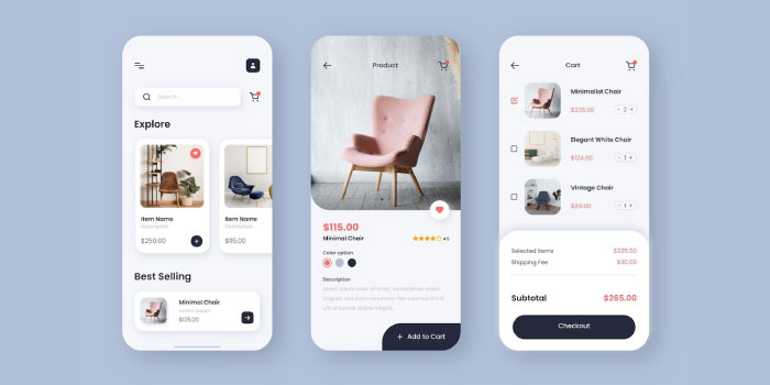
Interface Basics
The iPhone app development and design guidelines define the three key elements of the app experience.
Bar
A bar indicates where the user is in the app (status bar), provides navigation (tab bar), searches for information (search bar), or performs some action (toolbar) to increase the view.
Views contain the main content that users see in your app. Text, visuals, animations, interactive objects – all these elements are in view.
Control
Control elements initiate actions (buttons) and send status/information (progress indicators).
Design Recommendations
IOS is a big platform, and while it’s impossible to provide all possible design recommendations in one article format, it does offer some of the most important recommendations for mobile designers to keep in mind.
Don’t Hide the Notch
The sensor housing, the notch, is an element that prevents the iOS screen from moving from edge to edge. It might be interesting to hide the notch area with a black bar to create a perfectly square screen, but it’s better not to; why? There are several reasons for this.
The screen appears smaller than it actually is. The cutout area gives the displayed content a sense of space. For example, if your app uses Google Maps, the notch won’t crop it.
Conclusion
Following platform design guidelines only help metrics like user retention and customer satisfaction. Users will feel at home instead of being in a foreign country when using the app. However, instilling comfort is essential to gaining followers. Make your users feel comfortable, and they will become permanently attached to your app. If you are looking for app development services at reasonable prices contact Creatix9.