The most recognizable logos share a common characteristic: they stand out against any background. The strategic use of contrast in a logo can create a powerful “pop” effect. When designing your company logo, you should pay special attention to how you can incorporate contrast. It may be what your logo needs to reach the next level. Let’s examine ten ways to incorporate contrast into your company logo design to create an outstanding logo.
What Is Contrast in Logo Design?
You may imagine contrast as making light colors whiter and darker colors darker. Contrast can be incorporated into your design in various ways, not just through color.
A contrast in design is a comparison of two visually striking components. Often, the contrast makes it easier for our brains to recognize a logo rapidly.
Consider the opposite of contrast to help us comprehend this concept: What if the black lettering in your logo was placed on a camouflage-patterned background? It appears to be a single dark blob from a distance, but if you stop and examine it closely, you can determine what it is.
On the other hand, consider the Nike check one of the most recognizable symbols in history. It is so elementary that you may question how it became so popular.
Nevertheless, the logo is challenging to overlook due to its distinctive appearance and stark contrast with its surroundings. Even if you are unaware of the logo, your brain recognizes it and “reads” it immediately.
How to Improve the Contrast of Your Logo?
Now that we’ve discussed contrast let’s look at ten methods to create a logo that stands out quickly.
Contrast by Combining Light and Dark Colors

The most common type of contrast employed is variations in your logo’s color palette. You can combine dark and light colors to accomplish this contrast level in your design. Ensure your logo’s components are substantially lighter or darker than the background.
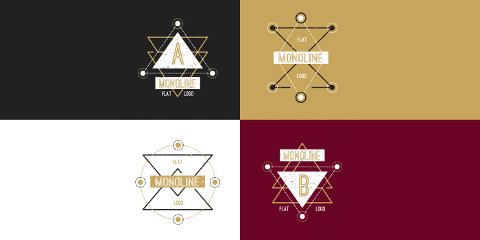
Although black and white are the most prominent and extreme examples of light and dark tints, this does not mean that you must limit your design to these two colors alone. Monochromatic logos (black-and-white logos) are compelling for contrast. However, if the logo’s features are too complex, it might lose its impact, and you need to fix the contrast.
You need to be more particular about the contrast between the colors in your logo. Here is some helpful advice! If, when you squint your eyes, two colors almost blend into one, this indicates that the contrast between them is insufficient.
To evaluate value contrast, you can convert your full-color logo into a monochromatic logo by completely desaturating it. This process will emphasize and highlight the contrast in your design. Value contrast refers to the difference in lightness and darkness between the colors in your logo.
During the design process, many designers utilize this to determine if the logo layout is practical without color. A robust design should be readable, distinct, and memorable even when reduced to a black-and-white logo.
Contrast With Direct Opposite Colors
If you’ve ever viewed a color wheel, you know that contrasting (or complementary) colors are directly opposite. To create a “louder” design that demands attention, contrast two colors from different regions on the color wheel. Complementary color pairs include violet and yellow, blue and orange, and red and green.
It is possible to produce contrast without using complementary colors.
You can achieve color contrast by avoiding the adjacent secondary and tertiary colors on the color wheel.
For example, using two similar shades of blue, like blue and teal, won’t give you much color contrast. Similarly, combining lime and yellow won’t create a strong contrast either.
Utilize color psychology to help you select the colors that will connect and communicate most effectively with your target audience. In Pepsi’s case, adding blue differentiated its brand from Coca-Cola. The transition from a red and white to a red, white, and blue design gave Pepsi a more modern, daring, and patriotic appearance.
Contrast with Saturation
Integrating gray into one of your logo’s colors can change its saturation. You can bring up the color intensity of a logo to its saturation. The greater the logo saturation, the more vibrant the colors appear; the lower the logo saturation, the more muted the colors appear. You can form contrast by putting a highly saturated color afterward to a desaturated one. This makes the colors stand out more and creates a striking effect.
So, playing with logo saturation helps you control how vibrant or muted your colors appear, and contrasting saturated and desaturated colors make your logo more eye-catching.
Contrast With Shape
One typical example of contrasting geometries is combining a circle and a square. However, there are differences between undulating (curved) and straight lines and between ovals and triangles. You can also consider how the shapes in your logo interact with the curves or lines of the font you’ve chosen. This can add an extra layer of contrast and visual appeal to your design.
Contrast with Texture
By playing with texture, you can make your logo stand out. Our eyes can easily distinguish between a smooth surface and a rough one. Changing the texture can make the difference between two colors or forms in your logo stand out more.
But while contrast is essential for making a logo stand out, ensuring your design stays cohesive is vital. Sometimes, to make a unique and cohesive mark, you might need to slightly lessen the difference between some elements.
So, feel free to try out different textures to make your logo stand out, but remember to find a good mix so that your design stays cohesive and visually appealing.
Suppose you are facing challenges in giving a contrast with accurate texture in your company logo design! Call us. We are the top logo design and professional digital agency that can craft a logo per your vision and market it well. Moreover, we are a top mobile app development company in the USA that can make well-structured apps. You can call us for the best logo design to market your brand digitally or want to develop an app.
Contrast with Font Mixtures
A successful design must carefully consider font selection. To avoid creating a cluttered logo that is difficult to read, resist the temptation to select several thrilling or intriguing typefaces.
To produce contrast, you can employ two drastically different typefaces. To balance a dramatic font, such as a script or ornate style, you should typically choose a simple sans serif or serif style. (Unlike sans-serif typefaces, which lack any extending characteristics at the ends of the letters, serif fonts include a small line or stroke at the end of each letter.)
In addition to heightening readability, the contrast between a simple and intricate typeface draws attention to the design.
Contrast with Kerning and Weight Typography
You do not need to choose fonts with substantial differences to produce contrast. Increasing the typographic weight or altering the letter spacing (a process known as “kerning”) can produce a slight contrast.
Consider a magazine cover in which the subheading or tagline is in a lighter font weight, while the magazine title is in a prominent, large font. Additionally, the title’s kerning (the distance between letters) is tighter, giving the words a more compact and authoritative appearance. The main title is eye-catching and visually attractive because of the difference in size and spacing, which also helps to unify the overall design.
Contrast through Negative Space
Using white space in a logo to generate an entirely new picture is known as “negative space.” It’s a fantastic way to add dimension to your logo and draw attention to specific areas.
The FedEx logo is an excellent example of how you can use negative space to add a second logo to a brand. Looking closely, you can see an arrow pointing forward between the letters “E” and “X.” The logo is given substance and visual appeal through the clever use of negative space, which also conceals a symbol. It communicates the company’s message of progress and expeditious, accurate delivery.
Contrast with Scale and Size
Using large sizes with subtle details creates another method of attracting your target audience. By contrasting proportions, you also create a design hierarchy.
The Starbucks logo is a real-life example of contrast with scale and size. The more giant, detailed siren stands out as the main focal point, surrounded by a complementary green circle and white ring. This design creates a memorable and recognizable brand logo.
Contrast with Orientation and Position
Think outside the box without hesitance! To add contrast to your logo, experiment with the angle of your design. Certain brands, like Baskin Robbins, use a playful font on a wavy background to establish a fun brand identity. Burger King also incorporates their logo with two burger patties by utilizing a sweeping design surrounded by two golden half circles, resembling the top and bottom buns.
You can incorporate images or other components into your design to generate enthusiasm through unusual placement. In the Xbox logo, three triangles are arranged in a circle to resemble an X passing through a button.
The logo for Pepsi, at the top of this list, employs more than just color contrast; it also features two shapes resembling liquids within an implied circle, and the undulating lines vary in position and shape to create a dynamic design.
Conclusions
You can enhance the visual allure of your logo through the use of contrast. It is time to apply your newly acquired knowledge of incorporating contrast into the design.
Using our company logo design service, you can easily create or modify your logo’s colors, dimensions, location, and other aspects. Call us and begin the formation of a unique logo with us!
Creatix9 US is your one-stop solution for all your design needs, whether designing a logo or digitally marketing your brand. As a top logo design and professional digital agency, we can enhance your brand’s visual attraction with expertly applied contrast in a logo that truly represents your vision.
Besides, we are the top mobile app development company in the USA, providing app creation solutions for a solid brand presence. Contact us today!